 I'm not sure about you but I am really not getting used to seeing Google's new favicon. It's definetely harder to find when you have multiple tabs open. And yeah…
According to Google:
“We recognized there was a need for a Google icon that would better work across multiple applications including web, mobile and client applications. We felt the small ‘g' had many of the characteristics that best represent our brand: it's simple, playful, and unique. We will be looking to improve and enhance this icon as we move forward.”
Simple, playful and unique? That's not the impression I have of Google at all. Am I missing something?
What do you think? Big G or little g?
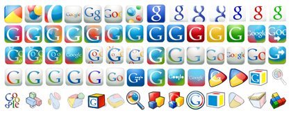
Here are some iterations of the Google Favicon:
Read more about it here.

Personally I like the first one in the box.
I know it isn’t clear but google is google.
Moreover I don’t understand Picasa icon for pictures, but now I can recognize it.
So definitely Google has power.
I also like the privious one. This is not so good.