Curious as to what fonts to use for your next design for a web 2.0 design/logo?
The FontShop have put together a small list of web 2.0 logos and what fonts they have used in their design. Some are exact and some are similar fonts. They break the logos down into 3 categories, The Softies (A clear trend in new identities is the use of soft, rounded typefaces dominated by VAG Rounded (AKA Rundschrift), but also including Helvetica Rounded, Arial Rounded, Bryant, and FF Cocon.), The Futurists (reflecting the technological breakthroughs of Web 2.0 with a look that says “tomorrow’s techno”) and the Classics (Safe standbys like Trade and News Gothic, Frutiger, Avenir, Interstate, FF Meta, FF DIN, and the always ubiquitous Helvetica continue to see use in new web logos).
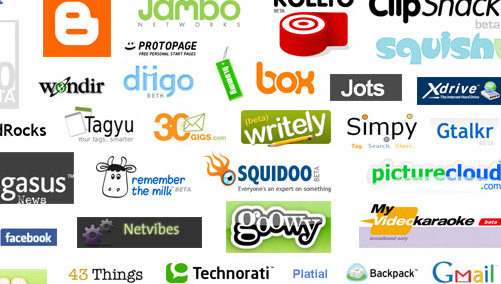 – A partial screen capture of just a small portion of Ludwig's web 2.0 logo compilation of over 400 web 2.0 logos. Pretty impressive.
Nice article. I bookmark it into our delicious. Thanks
It is amazing how many designers are still using arial. I was interested to see these logos categorised as “web 2.0” design, which I would interpret as user contributed/sense of community. A good logo that demonstrates this is the Joomla logo –
http://www.joomla.org
If you look closely it is made of people linking hands. Maybe it could be added to the list?
Nice Post! Font plays an important role in success or failure of a logo. Here is a great article about characteristics of a successful logo. Take a look at that
http://www.logoblog.org/wordpress/successful-logo/
yeah i love ff cocon, used it for my website’s logo
FF cocon is pretty cartoonish but it doesn’t look that bad in your logo. I think it might be the beveled gradient on it that makes it look ok.